What to Wear: Family Outfits
It’s been a while since I’ve done one of these and since we’re getting back into the full swing of summer shooting – what better time! I love being able to take extra special care of my clients and walking them through the whole process to try and make their experience as smooth and stress-free as possible. One of the ways I do this is by providing all of my clients a complimentary consultation before their portrait session. One of the first bits of advice I always give my clients is on tips of what to wear. Picking 3 or 4 colors helps unite your whole family without being overly match-y.
So let’s dig into some family outfit options!
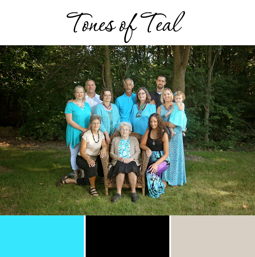
Tones of Teal
Here you can see we have one dominant color choice with neutral tones added in around it. Blues are always a popular choice and teal provides a nice vibrant tone to these images. To help balance out the teal, you see they’ve added shades of black, grey, white and cream. But that solid theme of teal runs throughout and helps tie everyone together.
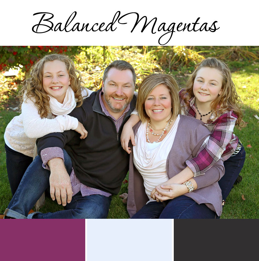
Balanced Magentas
Magenta is a fun color you don’t see often and the Watts family did a fantastic job of balancing out the warm, bright tones with grey and cream. You’ll also notice that mom and one daughter are in softer lighter tones and dad and the other daughter are in the plaid prints. This too helps create unity and balance in the image.
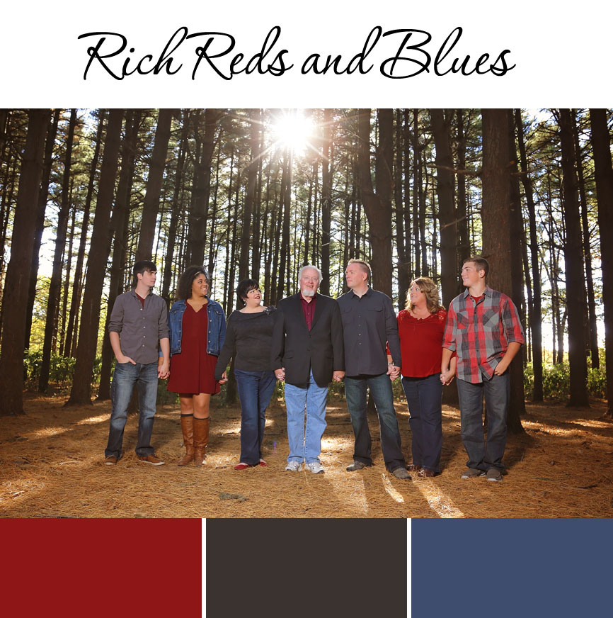
Rich Reds and Blues
These can sometimes be tricky tones to work with because they can feel very “little kid-ish.” But the deeper tones add a richness that makes this color palette feel very grown up and classy. The balance of warm red and cool blue creates a nice balance and the dark, charcoal grey keeps it from feeling too vibrant and bright.
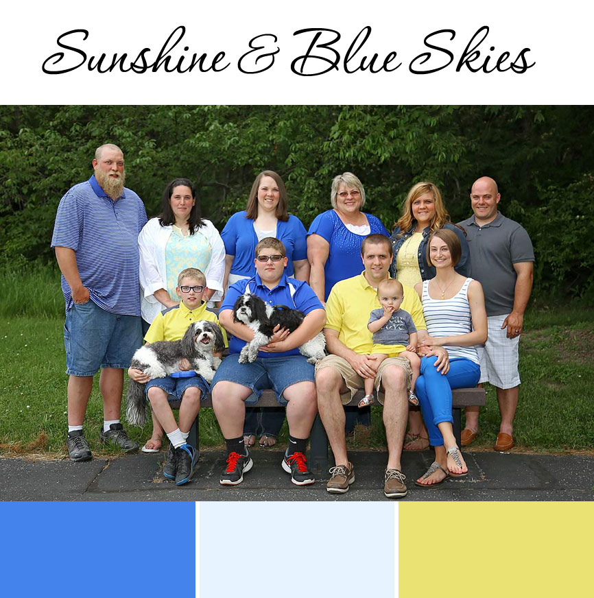
Sunshine and Blue Skies
Sometimes you’ve got to add a little sunshine to all that blue and that’s exactly what the Roe family did! Having the touch of vibrant yellow adds a dash of fun to these family portraits. Just like in the previous example – yellow is a warm tone and blue is cool – so the combination of these two colors adds a nice balance to their portrait.
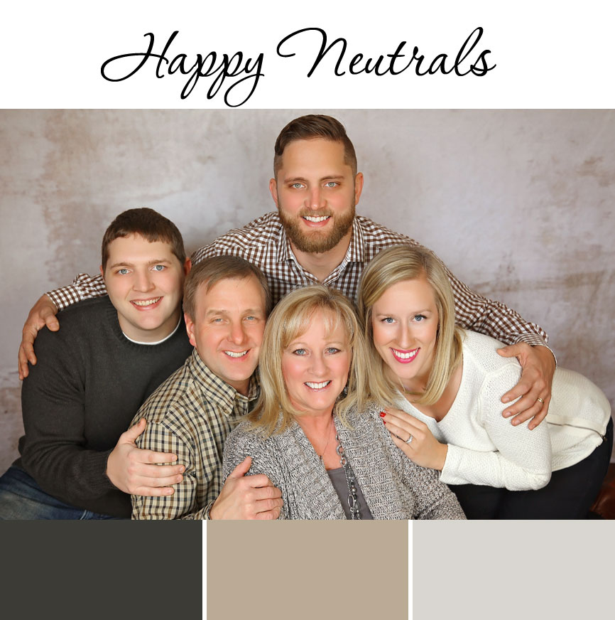
Happy Neutrals
Neutrals are an often under-appreciated color choice. But they can be an excellent option for letting your gorgeous faces really be the spotlight! The combination of knits and plaids add a nice bit of textural interest and simultaneously unifies everyone together.
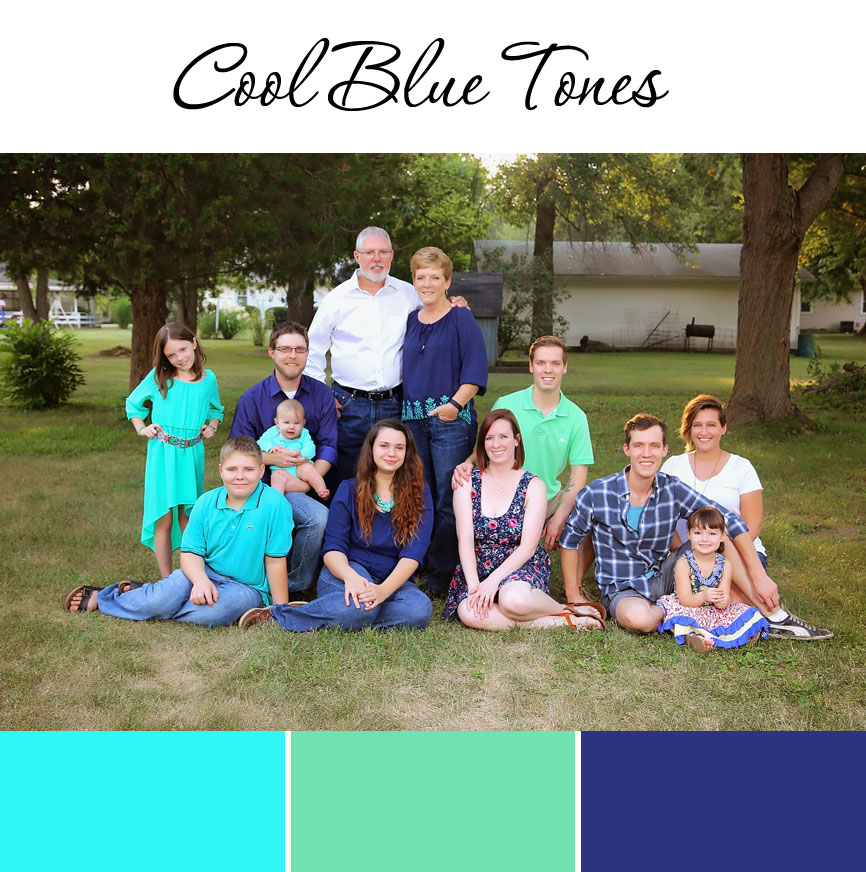
Cool Blue Tones
And lastly – back to our favorites – blues! Blue and green are both cool and calming colors, which makes for a nice zen palette. Here you can definitely see how individual families are dressed to match but the color palettes still help to tie the whole family together.
Well I hope that was helpful for you, and gave you some ideas for your family portraits coming up! I can’t wait to see what you put together for your family sessions and I can’t wait to help you capture these memories of your growing family!
 Previous post
Rich & Cassy’s Wedding | Decatur, IL
Previous post
Rich & Cassy’s Wedding | Decatur, IL
 Next post
New Fine Art Series: Harmony
Next post
New Fine Art Series: Harmony