The Updated Website is Here!!!
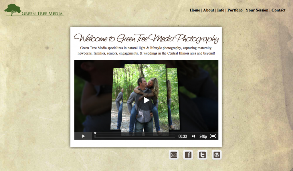
Well it’s official! The new improved website is finally up and running, & I couldn’t be happier. If you haven’t been on my website very much, you may be wondering what I’m even talking about because the overall look of my site hasn’t really changed.
I may be biased, but I love my branding so nothing about the look of my website is different. I still have the same aged paper background, he same white boxes with text and images in them, the same logo, etc. Basically I wanted to try and make the website as user friendly as possible and easily accessible from a variety of different browsers (mobile included).
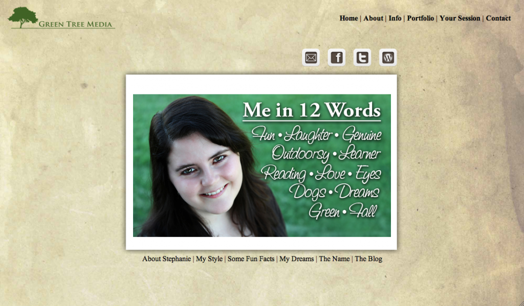
So we’ve change the navigation up a little bit in the hopes that it will be easier to figure out where to go. I’ve also added a lot more information for you to peruse. For example – the About page has an initial quick “Me in 12 Words,” but you can also learn about me, my style, some of my dreams and a random assortment of other fun things. I’m really excited about the Info page which in additional to the pricing and testimonials now has a whole section devoted to the products I sell.
Another plus is that the galleries on my site no longer require Flash so my entire website (with the exception of the home page video) can be viewed on any browser – phones included. It’s a huge pet peeve of mine when I can’t access a website through my phone because it’s all flash or when I have to download some program just to view a page. So I haven’t done that on my site either. You’ll also notice that all my videos require you to start them… none start automatically and I don’t have any music on my site either so that you don’t have to frantically look for the volume button if you come to my website while you’re at the library. 🙂
Eventually I’d like to add a behind-the-scenes video to the Info page and maybe an about me video. But for now I’m happy with where I’m at. The only changes that will occur are tweaks to keep it working and updating my portfolio.
I’d love to hear your thoughts because after all the whole goal of updating the site was making it easier for you! What do you think? Is it an improvement or is there something you’d like to see differently?
Contact Me | Visit My Website | Join the Facebook Fan Page | Follow Me on Twitter


1 comment
love the new site Steph! Looks and functions GREAT!