A Little Journal Face Lift
You may (or may not) have noticed that the journal got a little bit of a facelift. If you’ve been following me for a while – you know I love to write here and that I try to make sure to post every Monday, Wednesday, and Friday. (And as of right now – I’m at over 850 journal entries! That’s a lot of writing!) Well – every once and a while I like to freshen up the journal. Sometimes that means I completely revamp it, but other times – like now – it just means that I make some little changes that I feel make a big difference. So here’s some things you might have noticed:
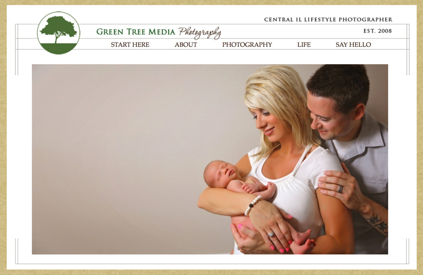
First of all – I updated a couple pictures in our Header images. I’m hoping to be better about updating these images regularly so that you can see different images in that top graphic from time to time throughout the year. But the other change that maybe you noticed is that the menu for the journal has changed a little. I felt like the old top menu was a little confusing and cluttered. So I decided to really simplify it and make it easier for first time readers to find what they’re looking for.
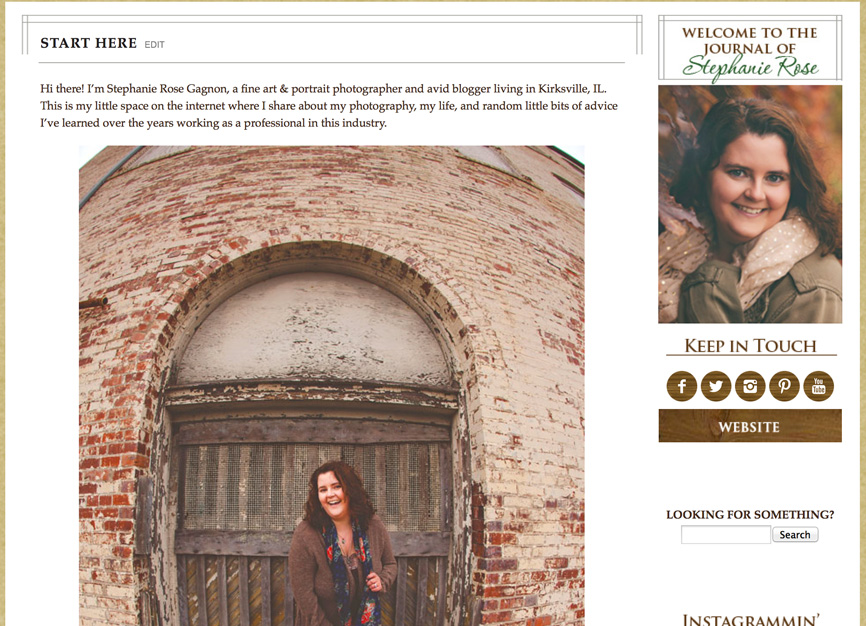
One of the new menu options is the new Start Here Page. This page is for those who may not have visited the site before and it gives them a quick idea of what type of posts I share here on the journal with a few quick links to some of my most popular posts. I’m excited about this hopefully handy tool for new visitors to my site.
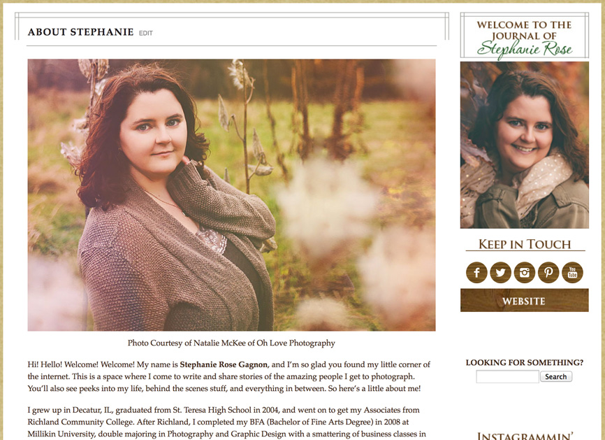
While the About Page isn’t new – it got a few new additions to it. There’s now a little more description to it and a couple more pictures (because who doesn’t love a picture or two). I felt like people might want to know a little more about my education, expertise, and passions. So hopefully people like these new additions.

Something else you might notice in the menu too – is that it has been simplified down into two journal categories: Photography & Life. The Photography section of the journal is where you’ll see my Business stuff (like product features, updates, behind the scenes, and business information), Portraits (where all my lovely and amazing clients are featured), Fine Art (where I’ll share my fine art work), and Tips & Advice (where I share things with and for photographers). The Life section of the journal will cover Glimpse at My Life (basically anything personal going on in my life), the Gratitude Project (my ongoing personal project), Baby Journey posts (kind of self-explanatory), and Thoughts & Ramblings (is where I’ll share my random little writings and things). Now these may change a little over time, but I LOVE this new simplified method of organization and I think you all will too 🙂
 \And then of course you probably noticed some of the updates to our side bar (on the right side of the journal). You’ll notice all our social media (and website) links have been simplified and consolidated right underneath my photograph. I figure this makes it convenient and it doesn’t take up much space. I also added links the magazines I’ve been featured in, the organizations I’m a member and/or founder of, the vendors I support, and 3 of my most popular journal posts. I think it’s kind of nice to have easy access to all these things.
So there you have it! A little peek at the updates to the journal. I hope you like them! And if you have any questions or issues with the changes – let me know and I’ll be sure to fix them right away! As always – thanks for reading!
 Previous post
New Fine Art Series: Hope
