Updating the Look
As an artist who took a number of design classes, I find myself constantly wanting to tweak and edit my website. It’s a habit that drives my mother insane, but I feel better knowing that I’m working to improve the site and make it easier for people to use. I would love to just hire someone who knows what they are doing to give them my ideas and let them create it, but unfortunately I don’t quite have a budget for that. Plus, I’m stubborn and absolutely refuse to use a generic template. So I’m left to my own meager knowledge of website coding.
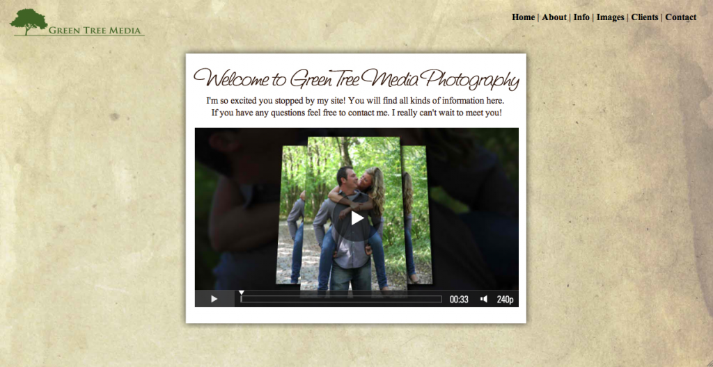
So on to what I’ve been working on changing. Something that really irritates me about the current site is the way the logo overlaps the navigation and center text. So in an effort to eliminate this annoyance I’ve basically reorganized the logo and navigation a bit.
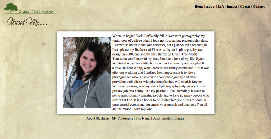
I had gotten tired of the lightboxes (those little boxes that pop up over top of the current screen). So I converted all those old pop up lightbox pages into actual full html pages. So instead of having this page pop up in a light box like it currently does – it now has it’s own page with a picture of me and the rest of the About Page navigation below.
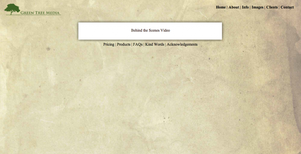
I’ve been wanting to incorporate more videos into my website, so I thought this would be the perfect opportunity to do that. I’m planning on adding a Behind the Scenes video to give people an idea of how I work on a photo shoot. I don’t work in a traditional posed photographer style, and I’d like to let me clients be able to see a little peek into how I work. It’s something I’m proud of and something that sets me apart from other photographers in the area. I haven’t quite decided or figured out how I’m going to do it yet, but I’m excited about the idea.
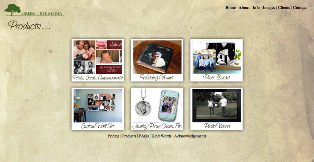
The last little addition to the new design is a Product Page. I thought it would be nice to create a page with links to all the products I offer with a little image and blurb about them. As you can see below I’ve broken the products down into 6 different categories: Prints & Cards, Wedding Albums, Photo Books, Custom Wall Art, Jewelry & Phone Cases, and Photo Videos. I tried not to get too wordy in the individual product descriptions – just enough information to get an idea about the product and letting people know to contact me for more information.
So that’s what I have for the new site as of right now. I don’t know when I’ll officially have it up since I’ve got a couple videos to create for the new design. But what I’d love is to hear your thoughts! I put a lot of time and effort into trying to make my site easy to use for all of you, so I would really love to know what you think. Any input?
Contact Me | Visit My Website | Join the Facebook Fan Page | Follow Me on Twitter


